

I’ve had a love/hate relationship with the color pink that goes back a long way. From the time I was little, I thought pink was a sissy color and wouldn’t wear it. I was always attracted to black, but wasn’t allowed to wear that. “Why?” you ask? Since it wasn’t readily apparent to me either, my father explained that only tramps wore black clothes. Even a black jacket was unacceptable, since only hoodlums wore those. Without having to ask, I knew black hosiery and fishnets were verboten. I sneaked those out in my purse, replacing my nude hose with the black ones, and adding a swipe of Yardley’s frosted blue lipstick once I got to school. Of course, I got caught… and grounded.
By the mid-sixties, denim and paisley comprised the fashion scene, and I was smitten.
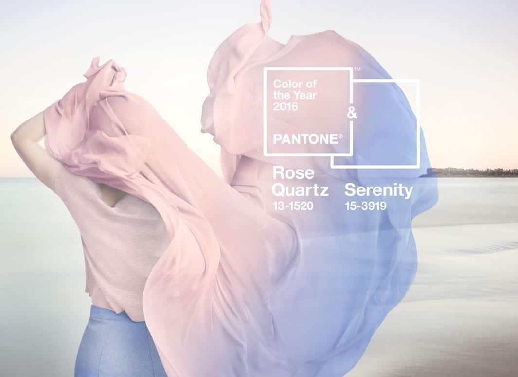
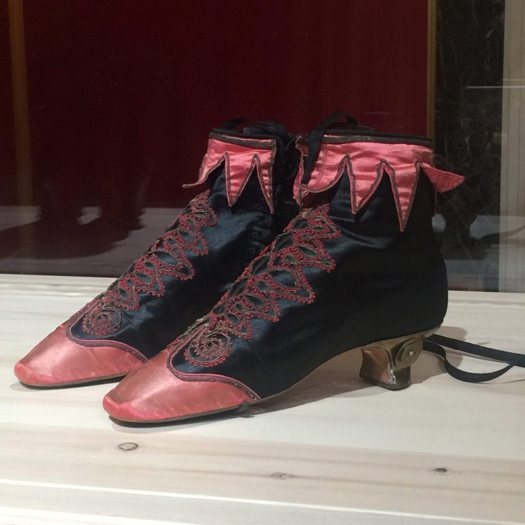
Each year a new color is chosen, and the results are published in December. This pronouncement shows up as everything from the newest nail polish colors and fashion trends, to bridesmaid dresses, florist’s arrangements, and interior design. This is the first time in 50 years that Pantone has picked two colors.
Leatrice Eiseman, Executive Director, Pantone Color Institute explains, “Joined together, Rose Quartz and Serenity demonstrate an inherent balance… reflecting connection and wellness as well as a soothing sense of order and peace.”
Leanne Marshall, winner of Project Runway Season 5, used this rose/blue combination during New York Fashion Week, saying she was inspired by “a sense of apocalypse.” She feels many people zero in on pastels to escape.
I see these colors as more than an escape. I feel they are an important indicator of where we are as a collective unconscious, and I think our future is rosy. Pink represents a state of higher consciousness and love, while blue–our throat chakra–represents our ability to analyze things in an advanced way and then communicate them.
Together, pink and blue, traditionally used for babies, could illustrate the infant stages of acknowledging and accepting our need for balance between the masculine and feminine, and an enlightened ability to communicate.
As Ms. Eiseman pointed out, “Rose Quartz isn’t baby pink, it doesn’t have that wimpy feel.” In that case, I’ll buy that lovely pink blouse I’ve been eyeing. It will look serene with jeans and sandals this summer, but it’s going to look très chic with a black leather skirt and black hose this fall!


6 Comments
Those are very pretty colours. I too wear mainly black (or grey) but love these as accent pieces.
Thank you so much Jen – they’d look gorgeous on you!
They will make perfect accent pieces, won’t they? Especially with black – so French!
XO Donna
Donna, how wonderful to see you here! Your words are always so insightful and inspiring. I’m looking forward to following your posts here, and to reading your new book very soon!
Susan, it’s so wonderful to be here!
Thank you for your kind words, you always know how to make everyone feel so valued – such a gift.
XO Donna
I’ve never been a pastel kind-of-girl; usually neutrals that include leather and suede. This week, however, I bought a pair of taxicab yellow, taffeta pants and a multicolored belt with pearls!! Oh, my stars! What got into me? xoxox, Brenda
I can just see you rockin’ those yellow pants, like riding in on a beam of sunshine! I love it!
Photos, please?
XO